Getting Started#
Installation#
The package can be installed via PyPI.
pip install beautiplot
uv add beautiplot
Alternatively, you can clone the GitHub repository and, depending on whether you want to develop it or not, run the following command(s) in the cloned directory:
uv sync
uv sync --all-groups
uv run pre-commit install
Quick example#
Let's start by importing beautiplot and numpy.
import beautiplot.plot as bp
import numpy as np
Before creating a figure, you should configure the plot width to match your document's text width. This ensures that font sizes and line widths are consistent with your document. You can find the text width of your LaTeX document by adding \the\textwidth to it.
from beautiplot import config

# Set the width to the text width of your document in pt
config.width = 426.79135
Next, we generate some data - a damped oscillation in this case.
t = np.linspace(0, 10, 1000)
y = 5 * np.exp(-t / 2) * np.cos(2 * np.pi * t)
Now, we create our first figure using the newfig function. You can specify margins (in bp) using left, right, top, and bottom. If you don't know the exact values, you can start with a guess. When you save the figure, beautiplot will analyze the layout and suggest adjustments if content is cut off.
fig, ax = bp.newfig(left=40, bottom=35)
We then plot the data and label the axes. You can use LaTeX syntax for labels.
ax.plot(t, y, label='Damped Oscillation')
ax.set_xlabel('Time $t$ / s')
ax.set_ylabel('Amplitude $A(t)$ / cm')
bp.legend(ax)
Finally, we save the figure. Since pgf is used as a backend, you cannot use plt.show(). Instead, you must save the figure. Here, we use png for visualization, but for publication-quality figures, you should use pdf.
bp.save_figure(fig, 'damped_oscillation.png')
If any labels or ticks are cut off, beautiplot will print suggestions in the terminal to adjust the margins or spacing, for example:
Suggestion: Adjust margins: left: +5, bottom: +2
Iterative Adjustments
Sometimes, adjusting the margins changes the available space for the plot, which might cause Matplotlib to change the tick labels (e.g., reducing the number of ticks or changing their format). This can lead to a new suggestion in the next run. If you find yourself in a loop of suggestions, consider fixing the tick locations or labels manually to stabilize the layout.
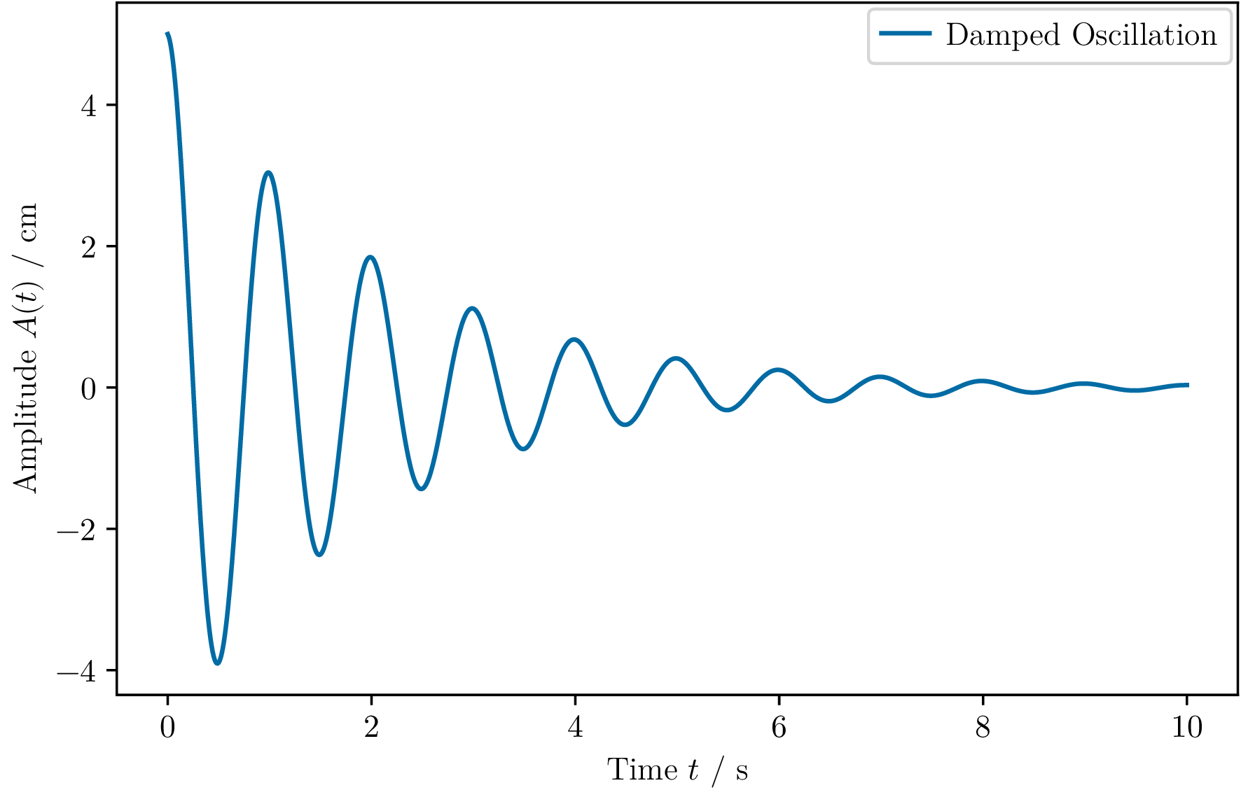
This simple example introduces the basic functionality, but beautiplot truly shines in more advanced scenarios.
For more detailed examples see the Tutorials section.
You can find documentation for all available functions and settings in the API reference.